A Picture Is Worth A Thousand Words
What do they say? A picture is worth a thousand words. So why not use illustrations to bolster the case for one format or another? Because the manipulation of an image or the subconscious message that is delivered can be as easily skewed as a whole paragraph of words. So here’s a couple of my favorite pictures AND why they contribute to the continuing confusion over which formats are the “best”.
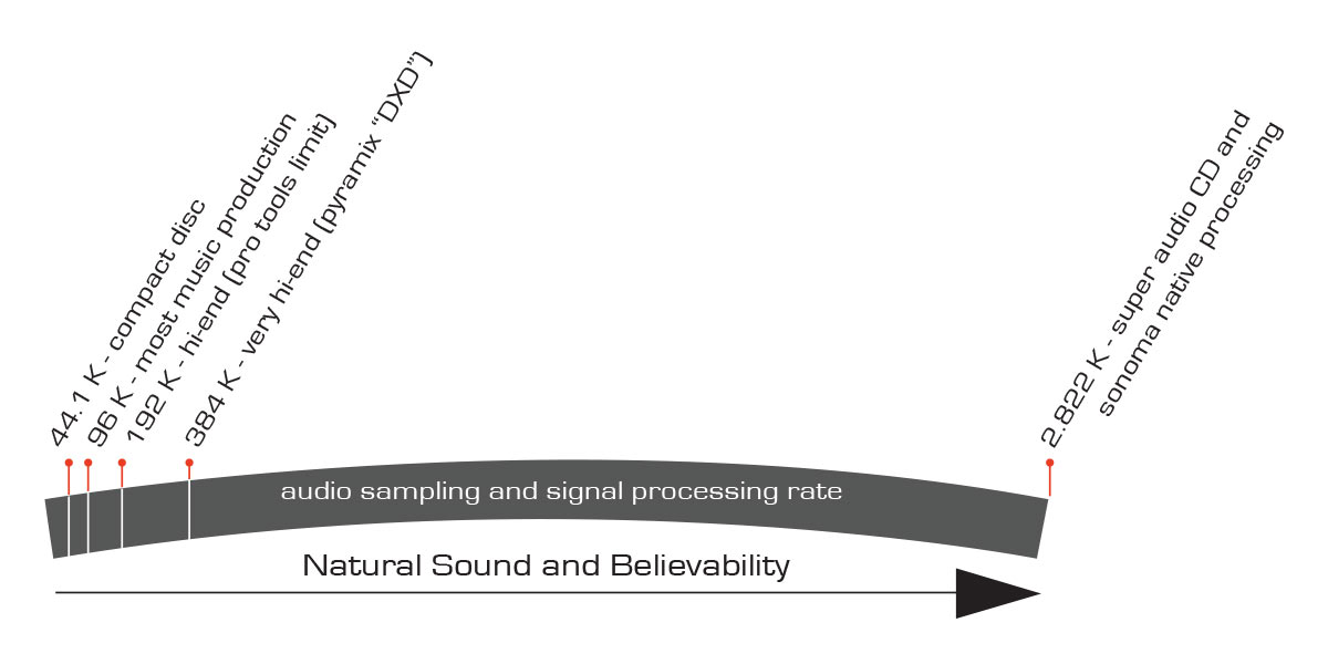
The first one is something I posted some weeks ago when SuperHiRez.com came online. This is Chad Kassem’s new sister site to Acoustic Sounds. The new site has gotten a lot of attention in the mainstream press…I’m jealous. However, it’s frustrating when the writers at USA Today or one of the other publications simply reprint the information in the company’s press release without bothering to do any fact checking. The sub title on the USA Today article by Mike Snider is, “Kansas firm raises bar on high-res music downloads – Looking for a richer sound from your music downloads? Direct Stream Digital delivers 64 times the resolution of compact discs and is available for the first time in a downloadable format.”
Do I even need to bother to correct this gross exaggeration? Yes, I wrote a comment on the USA Today page but the damage is already done. The average USA TODAY reader will see that, maybe go out an download an album from SuperHiRez.com and he horribly disappointed that the sound is the same as the CD they’re used to. This is the same misinformation that was passed to Laura Sydell at NPR and which took so much time to correct.
So here’s the diagram once again. I recreated it as an illustration so that you can enlarge it and check out the copy that it contains.
Figure 1 – A ridiculous chart supposedly showing the ultimate superiority of a standard DSD 64 file. (Click to enlarge)
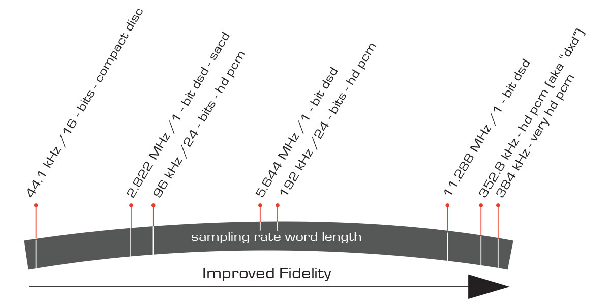
Here’ a remapping of the same illustration with the relative merits of the formats without the fabrications that someone felt were appropriate.
Figure 2 – A remade graphic with the relative positions of the various digital formats more closely aligned to reality. (click to enlarge)
I know, I know…I put the PCM versions higher up the scale than the DSD versions. This is only because there’s not room to put them on top of each other. I fully admit that DSD can deliver a pleasing, euphonious musical experience. But DSD 64 (when you factor in the word length AND the sampling rate…which they conveniently failed to do) was actually meant to simply do a better job on the audio band (slightly better than CD AND have surround sound capabilities). Fifteen years ago, the engineers behind the format couldn’t have imagined where we’d go in terms of sample rates and word lengths. And they certainly wouldn’t have been able to conceive of the vast improvements that have been made to the ADC/DACs that we have for PCM audio production. The technology of our equipment has outstripped the demands of the music marketplace.
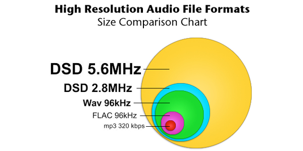
Chad’s graphic is just about the most ridiculous representation of fidelity and formats I’ve ever seen…but here’s another that I’ll leave you with that attempts to skew the information with the size of the circles. I’ll leave you to make your own conclusions.
To be fair to Cookie and Downloads Now!, their graphic does say that it is displaying the file size of the represented formats and NOT their fidelity. Still, I’m not sure the casual website visitor wouldn’t take this to imply that 5.6 MHz DSD isn’t the best of the group. File size doesn’t mean better…it simply means bigger. If you start with an analog tape master and capture it at 5.6 MHz all that extra space that available to get past the noise is wasted…there’s nothing up there to capture!


